Hello friends! I’m Shelly Cluff, and today I’m diving into the world of watercolor swatch cards. You might think this is too simple, but I believe it can be incredibly helpful for many of you. So, let’s get started!
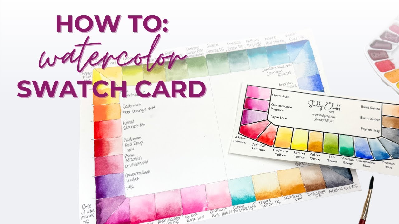
Here, I have a brand new palette—one that I actually fill and sell on my website. If you're curious about getting one, you’ve probably seen it in my videos before. Alongside it, I have a swatch card printed on watercolor paper. This card helps you see a couple of important things: first, how the colors look on paper (which is often different from how they appear in the pan), and second, the spectrum of color they create.
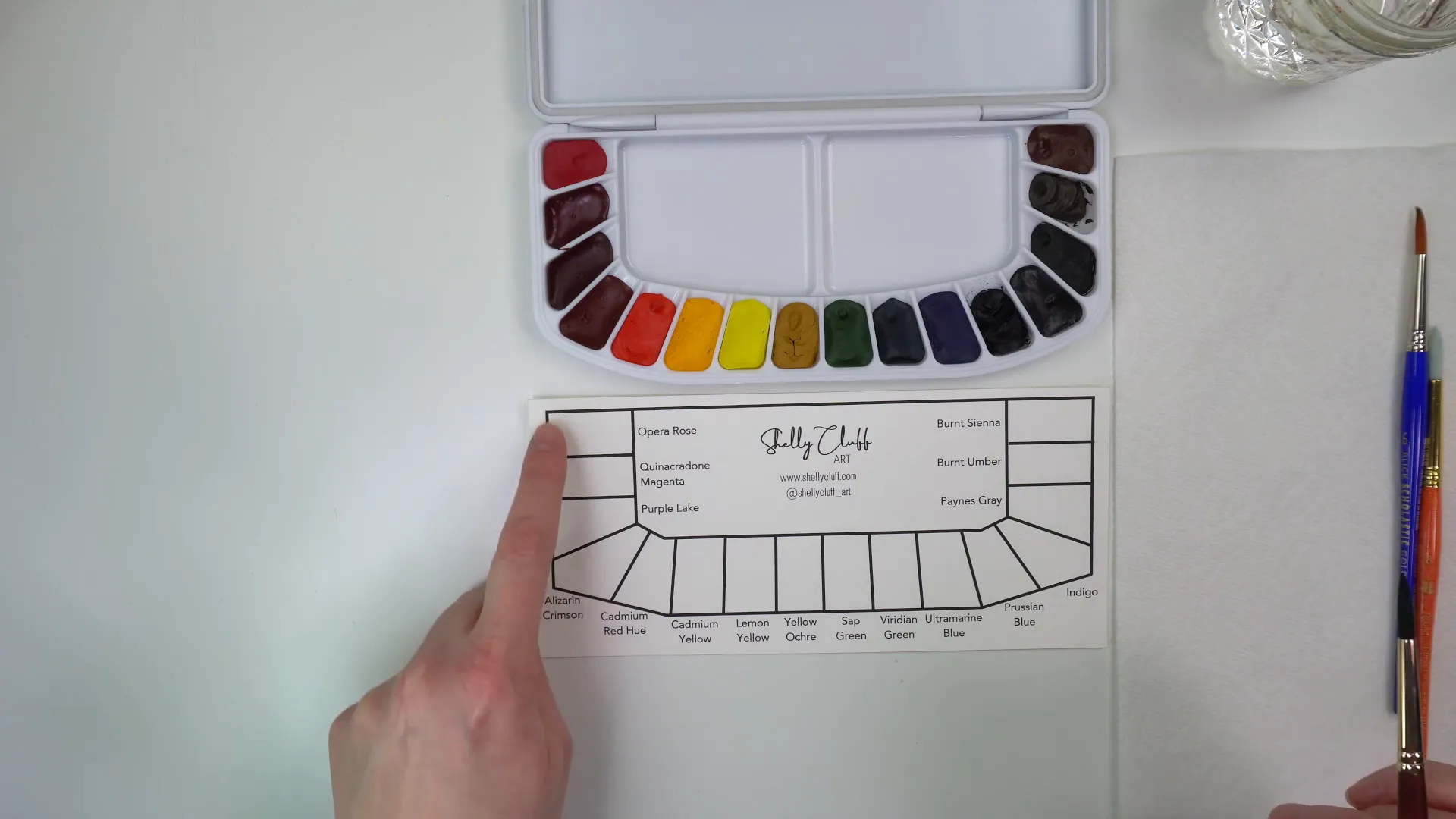
Let's dive into how to fill out a swatch card. I’ll be using my size six Princeton Neptune brush today. While any brush will do, the idea is to add a concentrated amount of color on one side and then wash it out. First, give your brush a good rinse, then swirl it on the color to get a nice concentrated amount. After swirling, make a stroke of that color on the swatch card.
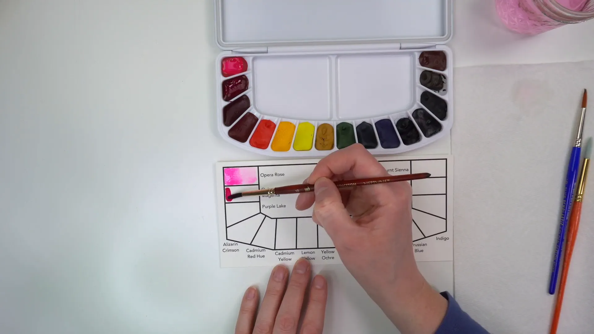
Next, rinse your brush again, scrape it off to ensure it’s not too loaded with water, and grab that color to move it to the other side of the swatch card. This technique creates a beautiful gradient effect. Let’s do the same for the second color!
For this palette, I’m using colors from Windsor and Newton. The first two colors, Opera Rose and Quinacridone Magenta, are from their professional line, meaning the pigment is a bit stronger. The rest of the colors are from the Cotman line, which are more affordable college-grade paints. They still work great, but they might take a little more effort to get the pigment to show up.
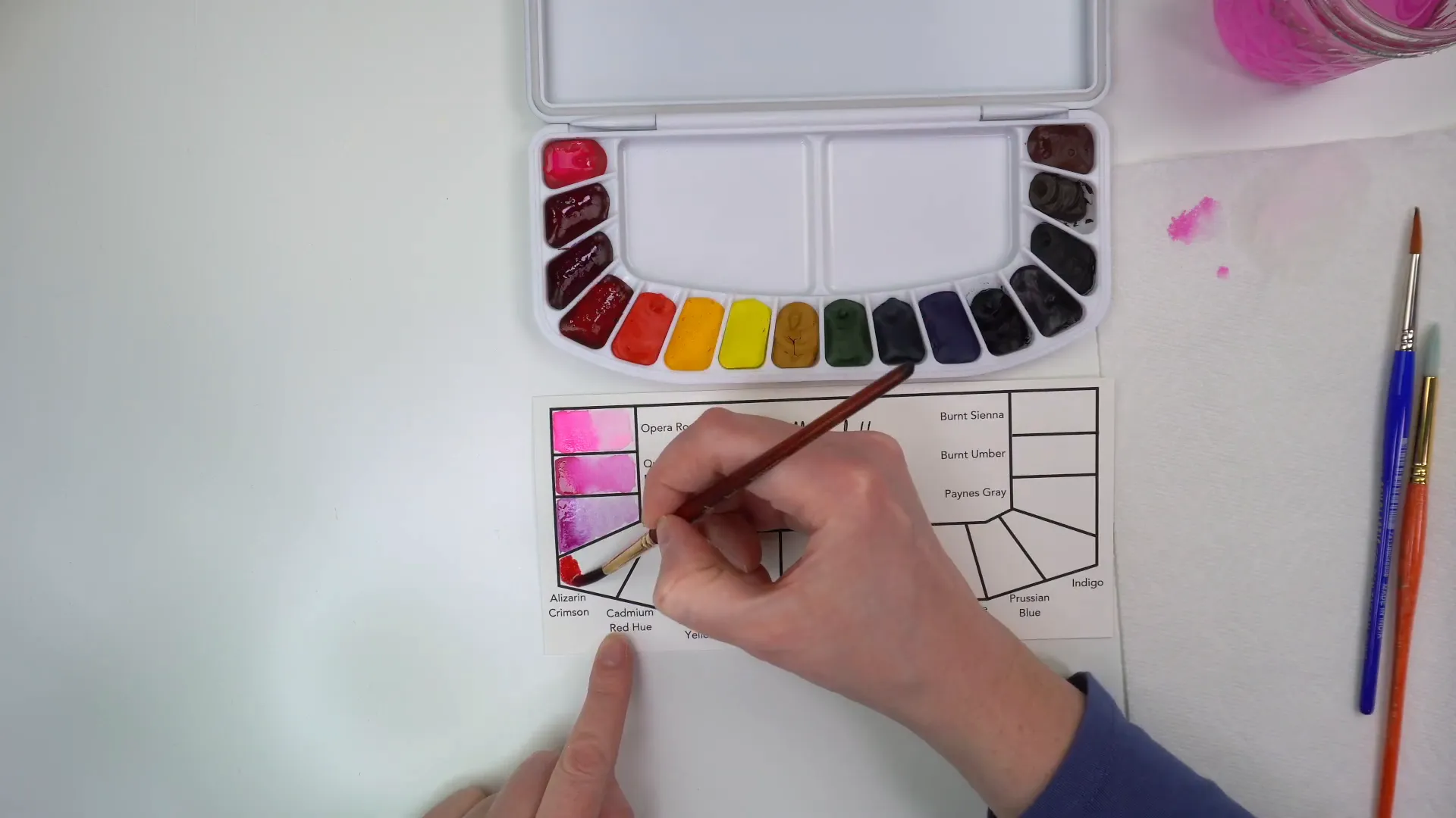
Now let’s move on to Alizarin Crimson. I’m putting in a minimal amount of water to keep that first stroke nice and concentrated. The goal here is to show both the most intense and subtle versions of each color. Creating swatch cards can be a fun and soothing activity, and it’s an excellent way to become familiar with your palette.
If you find it tricky to keep the colors from merging, try painting every other one. By the time you return to the first layer, it should be dry, making it easier to avoid mixing colors unintentionally.
The reason I make these palettes is that I couldn’t find a pre-made one that had all the colors I wanted when I first started teaching. This is the palette I use for my in-person classes, and I have a big stack of them! For the primaries, I include a cool and warm version of each color—two reds, two yellows, and two blues. I also add some handy browns for mixing, as well as a few other favorites like Payne's Gray and Yellow Ochre, which is fantastic for painting skies.
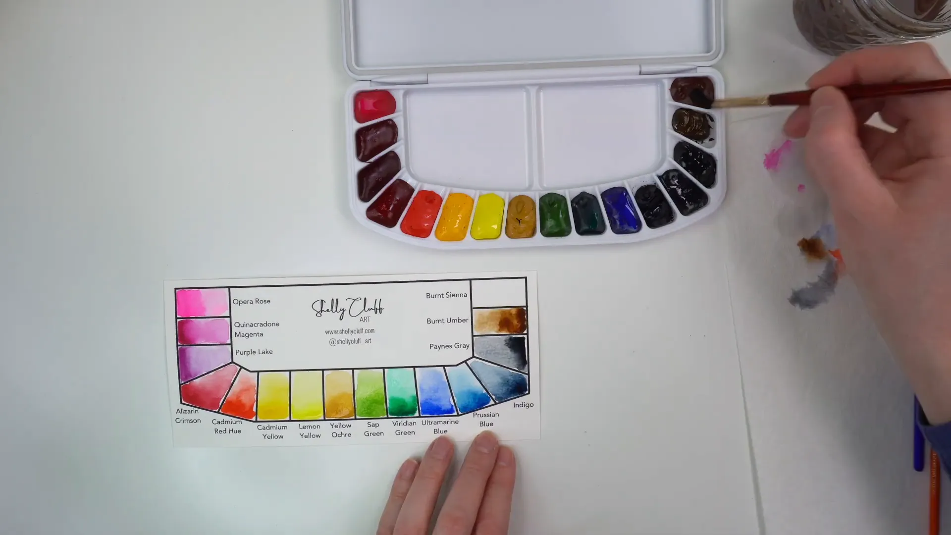
Yellow Ochre, when mixed with Prussian Blue, creates a realistic sky color. It's also great for muted tones without being too aggressive. I also love Indigo, a deep blue that adds richness to floral paintings. The greens I’ve chosen, like Sap Green and Viridian Green, are powerful pigments that work well for mixing.
Now, you might be wondering how to create a swatch card if your palette doesn’t come with one. It’s simple! For my professional palette, I bought empty ceramic trays, filled them with colors I love, and made a swatch card by tracing the palette shape on watercolor paper. Then, I marked where each well is located so I can easily reference it while painting.
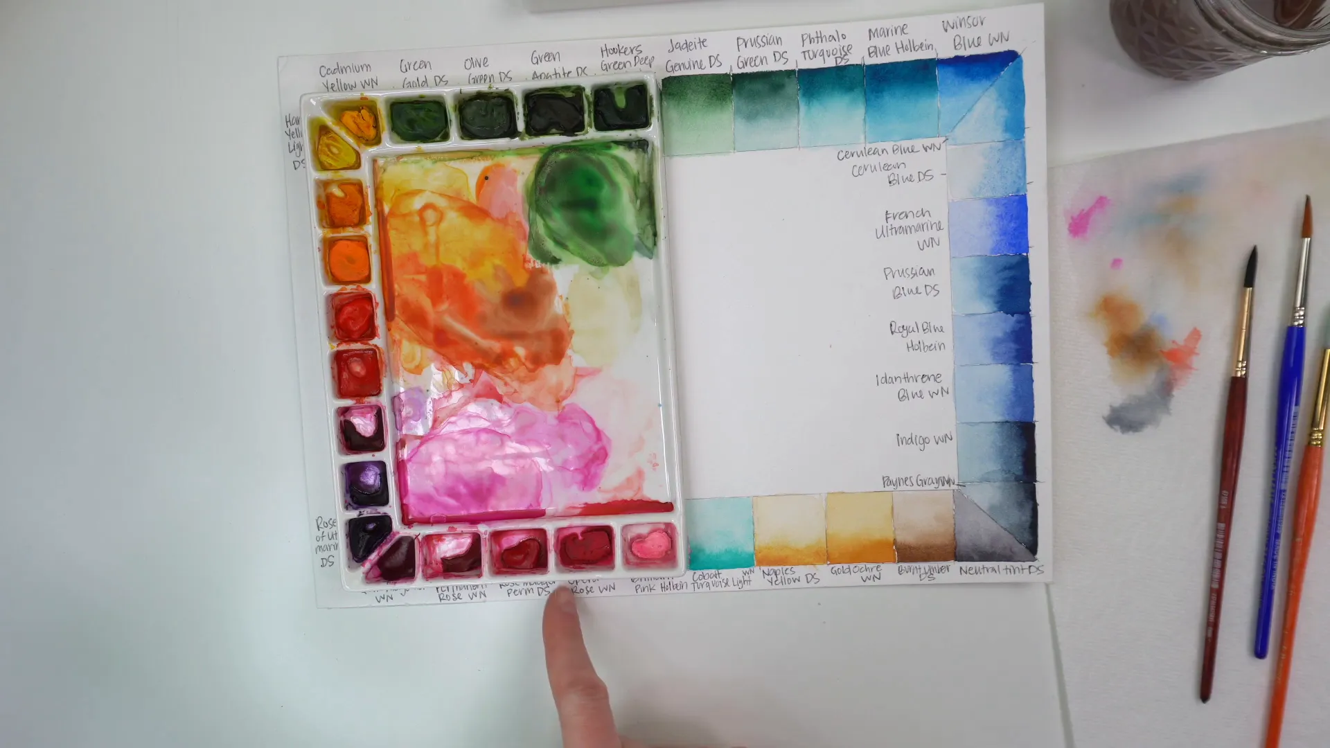
This method ensures I know exactly what color is where and helps me aim for the right mixes as I paint. I hope this was helpful for you!
Get Your Own Starter Palette
16 artist quality colors to follow along with all my tutorials!
I want one